Inner Mirror
(Overview)
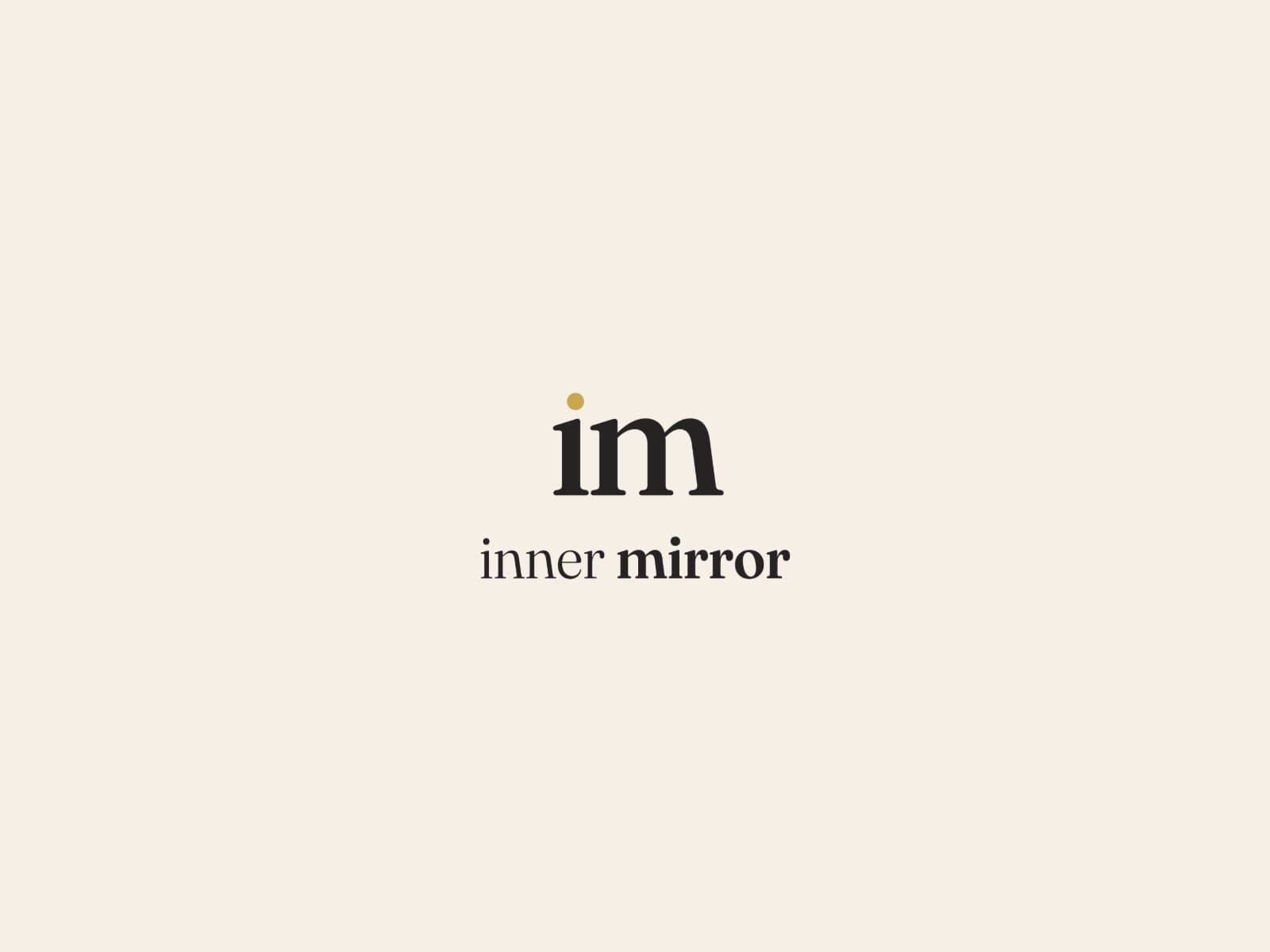
Inner Mirror needed one identity that could stretch across three offers: the LLC, Coaching and Circle. The system is built around a typographic "im" mark with a gold point held inside the "i" — the answer within.
Each sub-brand has its own voice: neutral charcoal and ivory for the LLC and coaching practice, warm plum, mauve and gold for the women's Circle. Ivory and gold are the constants that hold the family together.
(Challenge)
Three offers under one name risked feeling like three different companies. The brand needed one family with three voices.
(Process)
- 01
Architecture
Mapped the LLC, Coaching and Circle and how they relate to each other.
- 02
The "im" mark
A typographic mark that works on its own and as the root of each sub-brand.
- 03
System
Colour, type and layout rules that let each offer feel distinct but connected — plus illustrations, fourteen icons and eighteen social posts.
(Solution)
A three-part identity system held together by a single typographic "im" mark, with gold as a constant, never a fill.
(Palette & type)
- AaFraunces
- AaJost
- AaPinyon Script
(Outcome)
Delivered: three brand guides, a revised logo suite and a full asset pack.
(Gallery) 16 images
Keep scrolling →